
Minimal Mobile-first Hamburger Navigation – responsive-navbar.js
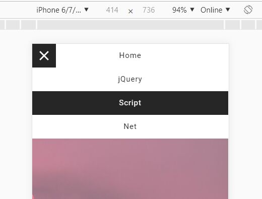
responsive-navbar.js is a responsive, mobile-first, jQuery based navigation system that smoothly slides up and down by tapping on the hamburger ...
responsive-navbar.js is a responsive, mobile-first, jQuery based navigation system that smoothly slides up and down by tapping on the hamburger ...
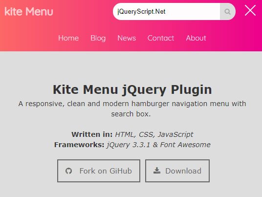
Kite Menu is a responsive, mobile-friendly navigation system that allows the user to toggle the navigation menu by clicking/tapping the ...

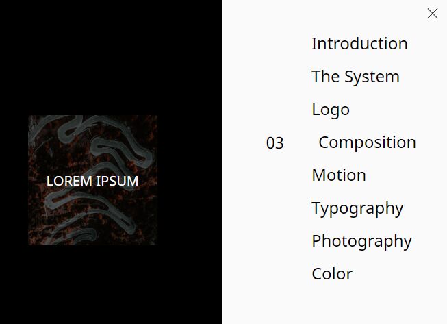
An awesome hamburger navigation concept that morphs the hamburger toggle button into a fullscreen overlay using JavaScript (jQuery) and CSS ...
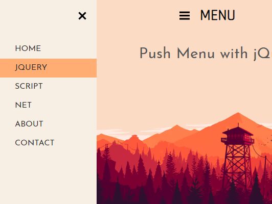
Yet another jQuery/CSS based push menu that enables a hamburger button to reveal an off-screen sidebar navigation while pushing the ...
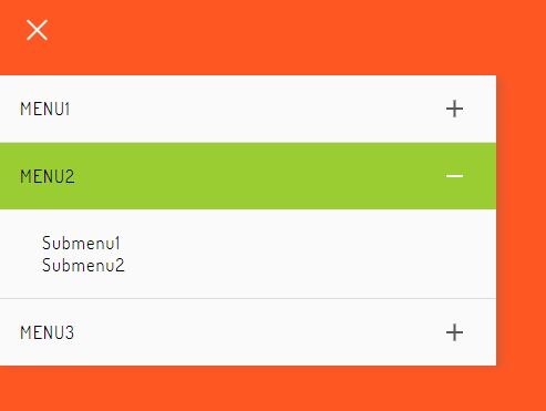
A fancy jQuery & CSS powered hamburger navigation that reveals a vertical accordion menu sliding from the edge of the ...

A fashion hamburger navigation concept that allows the user to toggle a responsive, fullscreen menu with a smooth slide animation ...
ggContentMenu is a jQuery plugin for creating mobile-compatible, SEO-friendly, multi-level off-canvas navigation with slide & fade animations.
A responsive, fullscreen, split hamburger toggle navigation for both desktop & mobile devices, inspired by Uber Rebrand 2018 Website.
Yet another responsive, mobile-friendly hamburger menu design for modern, cross-platform web applications.

Slide Menu is a variant of the Swipe Menu plugin that reveals the off-canvas navigation overlaying the main content instead ...
Free jQuery Scripts: Elevate your web development with our diverse collection of complimentary jQuery scripts. Enhance interactivity, streamline animations, and enrich user experiences effortlessly.